Monday, 8 January 2018

LO2: Photoshoot Plans

  
FRONT COVER


For the photoshoot I am going to get my models to dress up as an Indie rock band to connote that they are a stereotype of an Indie rock band, one of the members will be wearing fishnets, a mini skirt and a oversized t-shirt, the other band member will be wearing ripped skinny jeans and a band hoodie with a photograph of nirvana on it and the last member will be wearing camo trousers and a champion hoodie. They will also be skateboards in the photoshoot to connote what they do in there spare time similarily to the target audience of my magazine. The props needed for the shoot would therefore be a tripod, DSLR camera, lighting, skateboard and spare clothes needing them to get changed to look like an Indie group


CONTENTS PAGE 


For the photoshoot for my contents page I am going to get my models to dress up also an an Indie rock band, the models are the same band which will be pictured on the front cover and double page spread therefore they will be wearing the same clothing however it will be at a different location. The photoshoot will take place outside on a small park bench if them stood up showing hierarchy of the band and they should be listened too. Similarly to the front cover there will be skateboards in it again showing their hobbies relating to the 15025 target audience. The equipment and props needed will be a tripod, DSLR camera and a skateboard.


DOUBPLE PAGE SPREAD


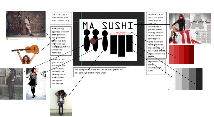
For my photoshoot for the double page spread I will be taking a photograph of the band inside one of the models house/ practice area. For this photoshoot I will need props for example their amp, guitar, speakers, microphone etc this shows the audience that this is there practice room and relate it to an indie rock band with these type of instruments.There will also be props in one of the band members room which give it a sense of reality and would relate it themselves with skateboard decks laying around, clothes rail and wall hangings which relate to fans of an Indie rock band.  The models costumes will be similar to the other photoshoots for the different pages. 

Wednesday, 20 December 2017

LO3: Setting Up Adobe InDesign CS6

 Print Specifications 

Full Page: 

Safe Area- 280mm and 200mm

Trim- 285mm and 203mm

Bleed-288mm and 205mm


Double Page Spread: 

Safe Area- 280mm and 395mm

Trim- 285mm and 400mm

Bleed- 300mm and 410mm


Advertising Rates:

Full Page: £2250

Half Page: £1125

Double Page Spread: £4400

I want my magazine to be a ‘normal’ standard size magazine because these seem to be popular also because it is only a monthly magazine it has enough room to have alot of new information on about new bands and gigs.
I used Adobe InDesign to design my double page spread and contents page, I got the insripartion of measurements for measuring up real magazines double page spreads.

LO3: Setting Up Adobe Photoshop CS6


The measurements I used when setting up Adobe photoshop CS6 I got from my proposal, I got these measurements from looking at real magazines and measuring them to get a sense of which size to my magazine. 

 Print Specifications 

Full Page: 

Safe Area- 280mm and 200mm

Trim- 285mm and 203mm

Bleed-288mm and 205mm


Double Page Spread: 

Safe Area- 280mm and 395mm

Trim- 285mm and 400mm

Bleed- 300mm and 410mm


Advertising Rates:

Full Page: £2250

Half Page: £1125

Double Page Spread: £4400

I want my magazine to be a ‘normal’ standard size magazine because these seem to be popular also because it is only a monthly magazine it has enough room to have alot of new information on about new bands and gigs.

Tuesday, 19 December 2017

LO4: Version Controls


This is from my front cover, which I edited through Photoshop, I made progression throughout editing these photographs from using different tools and adding text, photographs to make my magazine relate to the proposal of making a local music magazine


These screenshots were from editing my contents page through Adobe InDesign, I used boxes first to put down so I could insert photographs I also used measurements and had 4 columns which I got inspiration from a real kerrang magazine as everything was laid out specific on 3/4 different columns. I also used the boxes to add my main photograph for the contents page in and ended up with a photograph of myself at the bottom to show who made 'Plectrum'


These were edited through Adobe InDesign to make the double page spread realistic for a magazine. Using InDesign made the progression of how fast to get my magazine done quicker, as you can see from the first screenshot I started off using boxes to insert my text into and photographs of the band Sushi, I also inserted banners into it for each question of the interview to make it stand out more. The changes are drastic to from what it looked like in the beginning as the house colours are used continuously throughout the progression.


You can tell that I was organised throughout the process of making my magazine Pletcrum from the screenshots of where I kept my files with different files for each page consisting of screenshots of evidence of editing, each folder consisted of many different photographs and files with cal sheets/ risk assessment forms in 

Tuesday, 21 November 2017

LO2: Risk Assessments and Recce Forms


This is a photograph of one of my main location I used for my double page spread shoot, this is of the girls bedroom where we took the photoshoot. As you can see I followed the risk assessment when taking this photograph as I moved wires out of the way and had props in the room moved away enough for the models to not hurt themselves.


This was also another location I used for the photoshoot which is used in my contents page of my models and the band Sushi stood on a smaller flower bed wall, there was no risks at this location except for the models falling off the wall and hurting themselves however it was unlikely as the wall was only small (as circled in the photo below)


LO3: Following Codes And Conventions

Front Cover

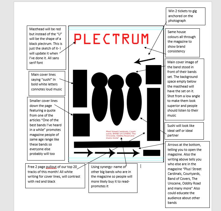
For Plectrum the front cover of it shows the main band 'Sushi' stood against a wall all with quite strong poses this relates to the other magazine of Kerrang of the sleeping with sirens band stood will strong poses and having the main guy looking into the camera to show he is the main one of the band. I also followed conventions similar to the Kerrang magazine as I had similar house colours using yellow, red, black and white as these colours relate to an Indie rock band. I used the same masthead colour of red which connotes danger to the music of Plectrum and also Kerrang have chosen a red masthead colour. Also the use of having banners at the top and bottom of my magazine front cover relates to the codes and conventions of a real magazine, in Kerrang they also use banners at the top and bottom. however have different shapes which also connote the demographic of target audience. The main cover lines on my magazine relates to similar conventions of Kerrang as they are both in bold sans serif font which stand out from the rest of the magazine page, however on Kerrang they also use banners underneath the writing which stands out for their page however it would look too blocky if I did it too mine, therefore I just used bold white writing and continuing with the yellow house theme colours. My models are dressed in quite dark colours with a stern face, which is often used in indie artists. The layout of my magazine is similar to Kerrang with a masthead, cover lines and graphics however these conventions are used in all magazines. The photograph taken for my front page is a medium shot so the audience can all see the band clearly and could be seen as idol self or an ideal partner. This is similar to Kerrang as they use a medium shot of their models and a medium close up of the main band member which also relates to ideal self/ ideal partner


Contents Page

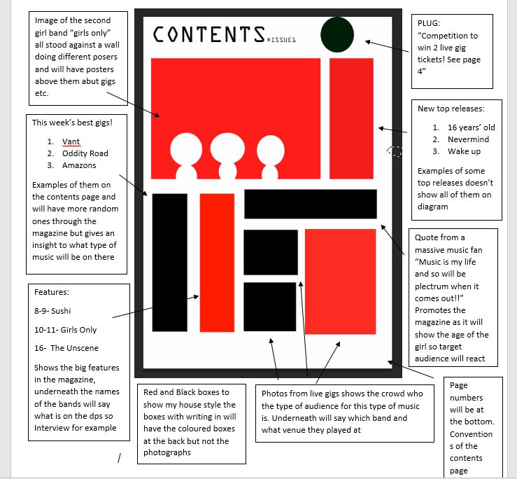
The photograph I have taken for my contents page consists of a medium close up ion my band Sushi stood on a a bench, my models are all dressed like an indie girl band would wear with hoodies on and skateboarding shoes this signifies to the audience that look stylish to an indie rock band and relate to an ideal self or ideal partner to the audience, by doing this it is making the reader want to read more about them. I took the photograph at abit of a low angle to make Sushi look more powerful. This photograph is similar to the one on Kerrang as it shows the band Metallica at a low angle which also shows they are superior which connotes there same meaning. The whole layout of my contents page is very similar to the one of Kerrangs as the photograph is in a similar place to my photograph, the banners are also the same colour and same place in the page which shows similarities between both indie magazines having the same conventions. The house colours I used are similar throughout my whole magazine this creates a brand and shows consistency. I also have added an author bio at the bottom of my page so the audience know what to look ready for in the upcoming magazines of Plectrum, this is a similar convention of an indie rock magazine as Kerrang have done the same thing in this issue of magazine having the audience excited for whats coming up and a photograph of the author. I used bold text throughout my contents page to make it stand out and catch the readers attention also catching the readers attention was the red banners at each main cover lines, this is used across a range of different genres of magazines . Next to my masthead I also included an issue number as it shows that this is going to be along lasting magazine and is following similar codes and conventions like the Kerrang one in a similar place to mine.


Double Page Spread

The photograph I have taken for my double page spread was similar to other conventions of a typical indie rock magazine as I had a photograph of the band at a medium shot as the models have already been seen on the other pages. I had my models against their band equipment this related to conventions of other music magazines in front of theirs to show that there are a indie rock band, however in the Kerrang magazine it doesn't feature their instruments as they are a well known band, however when introducing a new band it is good to show what type of instruments they typically use.  The layout of my double page spread is also quite similar to the Kerrang one as I featured a big main photograph to show the whole band and interview questions surrounding the photograph, this is used in a wide range of music magazines not only indie rock. The use of having a pull quote was to get the reader to want to read the interview before even glancing at it this is why it is a main cover line positioned on top of the photograph of Sushi, this is also a similar convention of when Indie music magazines use pull quotes to also give the reader a sense of who the band are from a small quote. The house colours are also similar to the Kerrang magazine double page spread using black and red, this is shown to be very popular within Indie magazines for example Kerrang, NME, Q which all tend to use red and black to give a sense of boldness to the articles.