PROPOSAL TEMPLATE
PURPOSE:
The purpose of my magazine is to entertain and to inform the
audience about gigs and upcoming bands also
it entertains the audience with interviews with the bands and
competitions
FORM AND
GENRE
1.
FORM: I am making a local Sheffield based magazine
2.
GENRE:
I am going to be making an indie rock type music magazine this is relevant to
Sheffield because there is a big fan base with this genre also alot of venues
like The Leadmill and the rocking chair so smaller pubs usually have bands on
with this type of genre of music
CONTENT
a.
FRONT
COVER:
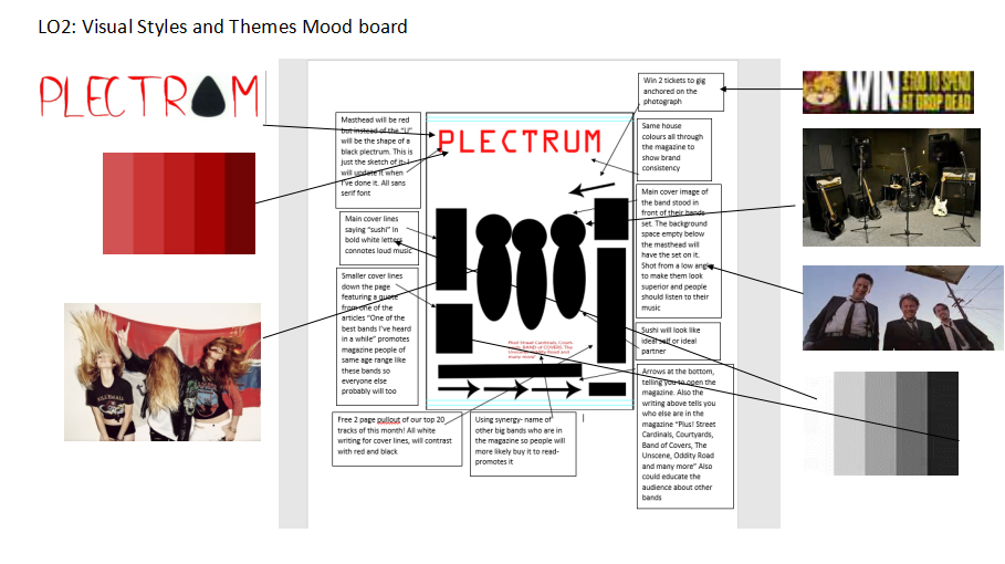
For
my front cover the font style will be sans serif font because it will stand
out. The masthead will be called “Plectrum” but the ‘u’ will be the shape of a
plectrum this is aimed at the target audience as they like indie rock bands
which connotes the use of the plectrum because within every band they use a
guitar. The actual plectrum will be black so it contrasts with the rest of the
masthead which is red and cover lines, this will appeal to my target audience
of teenagers with an interest of indie rock bands. The rest of the font style
will be smaller than the masthead which will be red but will also be sans serif
because it will be easier to read for the audience. The main cover lines will
be a medium sized text bigger than the normal writing so it easier to read and
will be the name of the band “sushi” in bold red letters half way down the page
anchored on to the photograph which connotes quite loud music but also soft
‘Romantic’ music at the same time because their songs are all different and
cover a range of meanings. This will appeal to your audience because indie
music is usually about that more than one subject and red is a popular colour
in Indie magazines There will then be smaller cover lines of text taken from
the actual interview and at the bottom of the page names of other bands
featured in the article “Plus! Street Cardinals, Courtyards, BAND of COVERS, The Unscene,
Oddity Road and many more” This will be in white connoting innocence and
purity of their music it balances out the contrasts of the other colours and
works well with red and black. The house style for plectrum will be red, white
and black because these are gender neutral colours but also mainstream at the
same time for this genre of music magazine. The masthead will be red, the cover
lines so all the medium text will be in white and the writing will be in black
as that’s the easiest colour to read and they all work well together this is
why most magazines use them. The main
cover image of plectrum will be a photograph of sushi who I am interviewing
stood in front of their set wearing typical indie rock clothes like some
wearing black ripped skinny jeans, a basic t-shirt and a leather jacket the
other girl in the band with a tight black skirt, fishnets and a long sleeved
top and the last girl wearing shorts and a top tucked in to her shorts this
connotes indie rock because these are a few of the stereotyped clothes what
indie rock girl bands wear. This will make them look like an ideal self or
ideal partner. I am going to shoot them at a low angle so they look superior/
powerful and that their music should be listened to. There wont be any cover
images on the front page because I want the audience to focus on just the main
article photograph of Sushi
b. CONTENTS PAGE:
Articles
what would be featured on the contents page will be about new upcoming bands of
the same genre music, new albums, this week’s best gigs locally and new top
releases it won’t have many different pages of contents of the content page as
it will only contain the main pages.
Images what will be on the contents page will
be a photograph of the 2nd band called ‘Girls Only’ and other smaller upcoming
bands also a photo from one of the bands live gigs. It will also contain a plug
of a competition to answer a question from what sushi’s most popular song is
and if correct the audience will then be in with a chance of winning 2 gig
tickets to Oddity Road, I am using synergy here as I am promoting the band
through social media Can answer it online
on a hyperlink from plectrums twitter page or alternatively on their other
social media Facebook and Instagram but will need to write the code in the
magazine to answer the question so only those who buy plectrum can do it or
they can send it off in the post which will be more reliable and won’t miss
someone name out who competed in the competition.
c. 1ST DOUBLE PAGE SPREAD:
The
feature of the first double page spread will be an interview with the band Sushi
on their new album and personal questions about themselves what fans have been
wanting to know. Sushi will be posing against a wall one in a black dress and
tights, the other in some black shorts and a patterned shirt and the other in
skinny jeans and a basic t-shirt. This connotes that their music is fairly loud
and that they aren’t a typical girl band as the clothing will mostly be black
or indie, little mix for example war more typical Topshop clothing. The models
I will be using are my friends who are all in a band as they show a difference
of genre of music because there aren’t many girl bands what are main articles
in magazines. The colour scheme for this double page spread will be the same
house style as the front cover to keep consistency throughout the magazine with
the headline title in black, the subheadings like the pull quote in red and the
main text in white although the scheme is different to the front page it still
uses the same colours therefore creating a recognisable band. The pull quote
will be taken from the interview about their new album what will be something
to make the reader want to read the article because it catches their eye so it
could have something what could sound rude but would mean something else when
the audience has read it. The headline title will be a name of sushi’s song which
is called good times but would relate to the sushi interview/article. The body
copy will be peer to peer as the target audience is of a young age 14- 25 so
all talk to each other informally therefore plectrum will be peer to peer.
d.
2ND
DOUBLE PAGE SPREAD:
A
smaller interview with another girl band but the main article as upcoming gigs
and new albums etc. Other information about bands of the same genre of music. A
photograph of the other smaller band and their interview underneath it. Will be
wearing vintage type clothing from thrift shops so what they typically wear and
will be standing in front of their drums, guitar etc. Will be dressed cool so
audience will think of ideal self or ideal partner that they look different to
most girls. Long baggy t-shirts, fishnet tights and black shorts with dr
martens or skater shoes on. All 3 girls will look quite similar in the way they
dress however are all different representing the audience because no one is the
same. Shot type will be low angle to connote their power. The location of the
shot will take place in a studio called the u-mix centre. There will also be a
photograph of the new album from other bands but mostly on the dps will be
writing. The quote will be the same as the front cover and contents etc. as it
will keep consistency. The headline title will be in red as it is bright and
the girls only won’t be wearing that much bright colour so will contrast. It
will say “16 years old” which is the name of their newest song. The body copy will
be in black and the pull quotes etc. will
be in white the interview and the name of another smaller bands album-
Released.
RESOURCES
AND PERSONNEL
1.
I will be doing the editing in my magazine,
taking photographs of my models using a DSLR camera 650D and doing the graphic
designs for plectrum
2.
I will need to use Adobe Photoshop and Adobe
InDesign throughout the process of making my magazine
3.
I will use my friends as my models for my main
band because they already look like a band and it should be easier to do this
instead of getting a real band
4.
The locations for the photoshoots of my magazine
will be at the U-Mix centre for taking the girl band Girls Only and one at the girl’s
house because she owns loads of instruments and we can make it work from there.
DISTRIBUTION AND MARKETING METHODS
1.
Plectrum could use synergy to promote the
magazine to make sure we get a higher readership figure. I will use online
methods to promote plectrum like Twitter and Instagram making pages for the
magazines to get followers to read small article headlines etc. so the target
audience will want to read the whole article. This would be effective in
targeting the audience because as they are young they usually all have social
media platforms to gain more followers therefore a higher readership
2.
I want my
magazine to be distributed in small corner shops and stands at the train
station so people can pick it up to read on their train journey or new visitors
of Sheffield to see what it’s about, outside universities etc. Also my magazine
will be in the show room and music venues like the Leadmill.The circulation of
plectrum will be around 3000 copies being made because as we are a new magazine
we don’t know the readership yet and as we are local we don’t have enough money
to produce more than 3000. The readership figures will be estimated at around
6000 because my magazine will also be online to view too and we will be giving
free copies around town etc. to get the target audience to recognise this new
magazine. Also the target audience will pass it on to their friends to read so
will keep getting passed along therefore we don’t actually know the real
readership figure. The frequency of plectrum will be monthly as we don’t have
enough money to produce it weekly and there will be more information if it
monthly as we are only a local magazine there isn’t much to put in it unless it
widely distributed, this means the magazine won’t get boring because there’s
loads of new stories in it monthly. I will be using below the line methods of
advertising like giving some of my magazines out for free before I distribute
them to see if the audience like it also I will be giving small pamphlets away
at the Leadmill so the audience know about Plectrum
Print
Specifications
Full Page:
Safe Area- 280mm and
200mm
Trim- 285mm and
203mm
Bleed-288mm and
205mm
Double Page Spread:
Safe Area- 280mm and
395mm
Trim- 285mm and
400mm
Bleed- 300mm and
410mm
Advertising Rates:
Full Page: £2250
Half Page: £1125
Double Page Spread:
£4400
I want my magazine
to be a ‘normal’ standard size magazine because these seem to be popular also
because it is only a monthly magazine it has enough room to have alot of new
information on about new bands and gigs.
Ellie is 19 and a student at Sheffield Hallam University studying
Photography. She enjoys gaming with her friends and socialising via social media.
Her favourite place to shop is Topshop and she’s always up to trend with the
latest brands. On a Saturday day time she’s with her friends and using them as
models for her photography or she’s out shopping, on a Saturday night she will
either go partying in the clubs/ gigs or have a chill night in with her
boyfriend
 Print Specifications


